Project Goals
• Brand mark redesign and new package design program to elevate the Chicago snack company to royal status
Of Note
• Our creative process, PROCEDE, established the “Heavenly Experience” brand positioning.
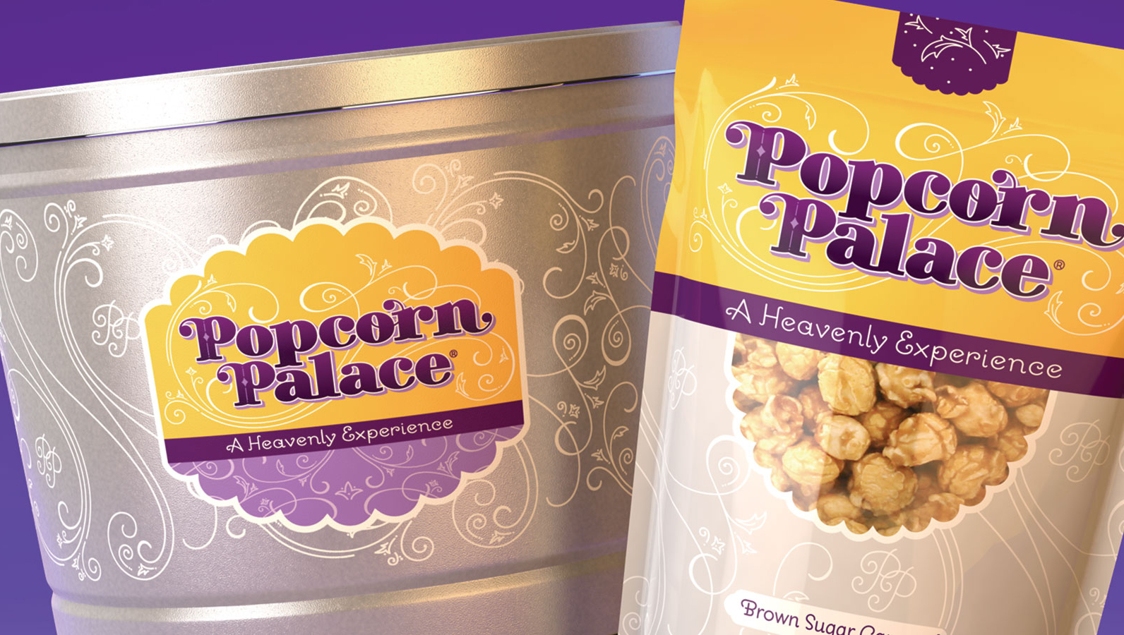
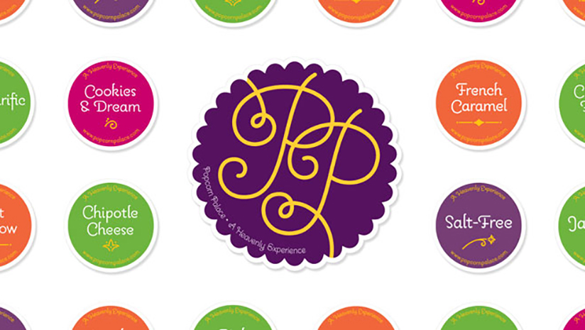
• Custom lettering, elegant flourishes and a royal color palette create premium brand presence and communicate gourmet quality taste
• Custom typography and calligraphy designed by R.BIRD, illustrated by Jessica Hische
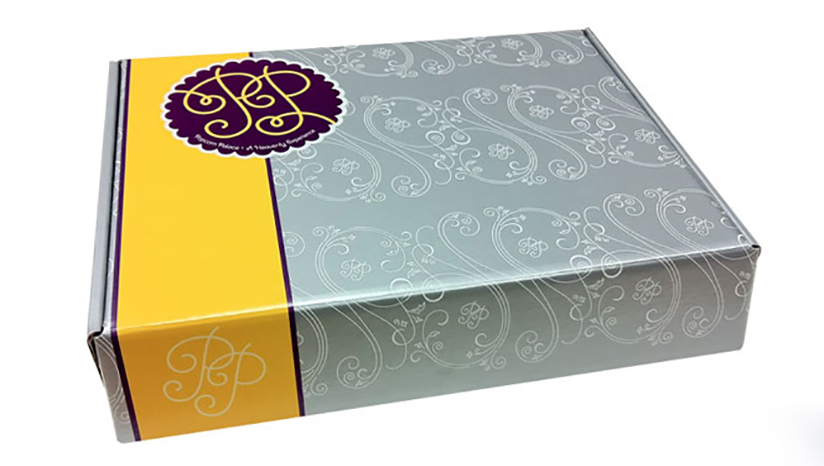
• Platinum tins, bags and boxes
• Golden yellow signals rich flavor
• Royal purples support the brand name and quality guarantee
“A Heavenly Experience”
• Preserve “Fun” and “Flavor” as core brand equities
