This past fall Bevolution Group reimagine and refresh one of their flagship brands, Dr. Smoothie. Working with their marketing team, we went through an extensive on-site brand strategy session in which we clarified and defined the audience, brand personality, competitive advantages, as well as the emotional and functional product benefits. We then distilled it all into a single Brand Essence statement: Drink Life In.
One of the primary drivers for how the refreshed brand would look and feel was the Brand Archetype of Explorer. Throughout our discovery process, we collectively decided the Explorer persona best represented the ethos of the brand: adventurous, resilient, upbeat, non-conformist and independent. This proved to be a cornerstone of our voice and design decisions throughout the project.
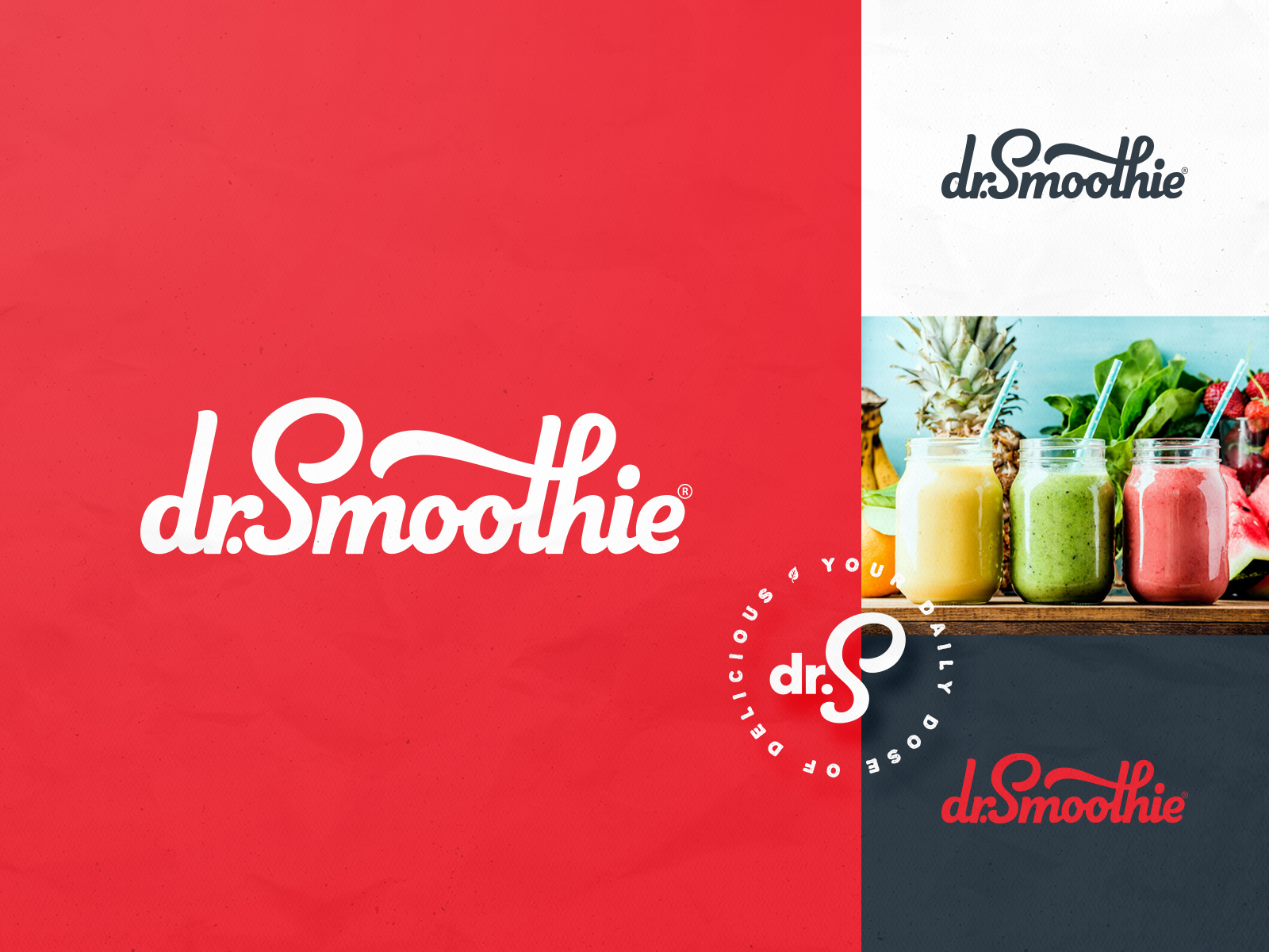
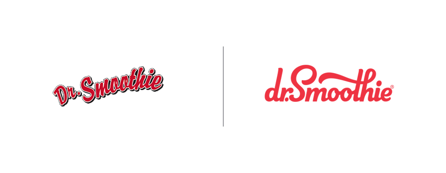
When it came to the logo and visual identity, we knew we wanted to stay with the color red and within the script family for type in order to take advantage of the brand equity that had been built in the marketplace for the past 20 years. We also knew the brand deserved custom handlettering, not a pre-built font. Throughout this process we created and continued to add to the Brand Style Guide, which serves as somewhat of a brand bible for all the essential brand information and execution guidelines. This gave the client a living document that ensured all future materials can be crafted consistently and remain on-brand, ensuring the Dr. Smoothie brand awareness and equity continues to gain momentum.
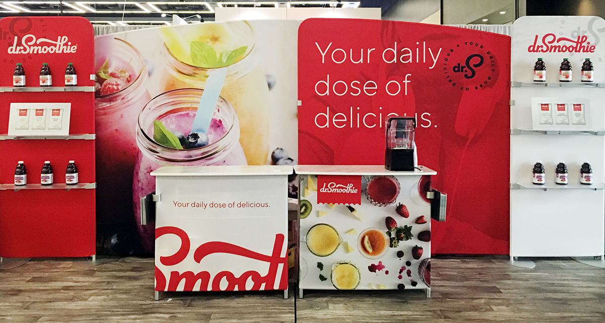
Overall, it was exciting to craft a brand that perfectly captured what made Dr. Smoothie unique and let it's personality shine through in all materials and in any medium.
