A new dental experience.
Designing a dental unit control and assistant panel that pushes the limits of the dental industry’s premium standards.
• The challenge
KaVo, an international leader in the dental industry, approached us with the vision of a dental unit control and assistant panel that would accelerate workflows and increase treatment quality for patients.
• The result
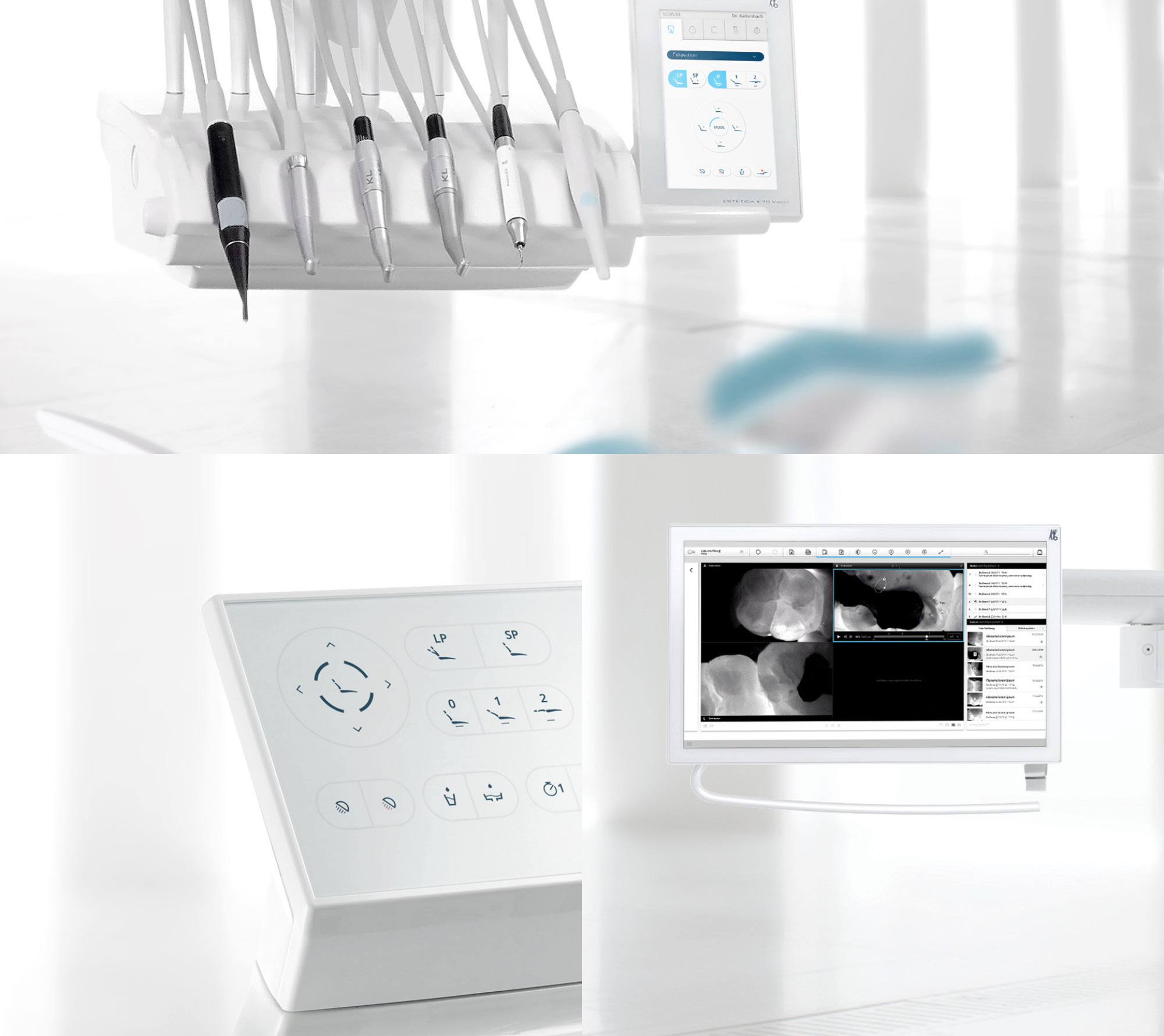
For the first time, complex patient information is accessible right where it is needed: at the dental unit itself, next to the patient.
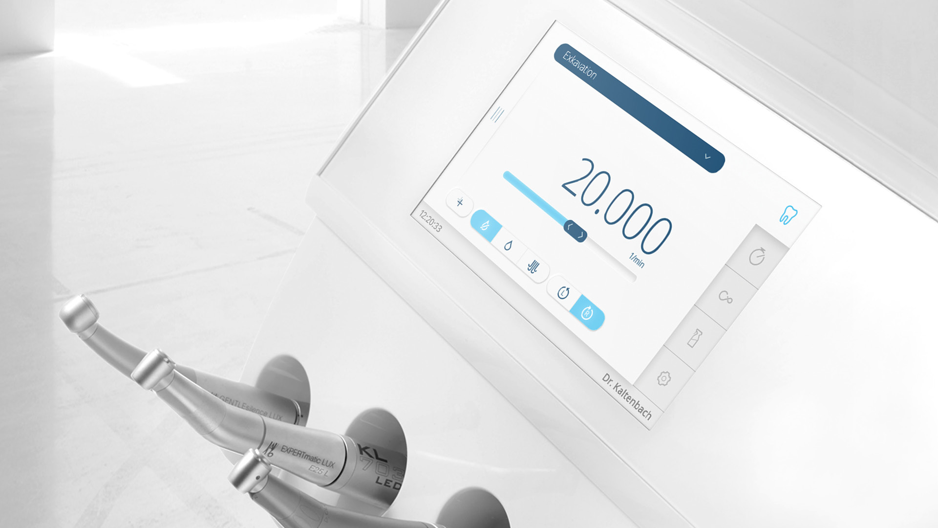
A graphical interface that runs on an innovative touchscreen navigation allows the dentist to operate the control panel effortlessly - setting a benchmark in the dental industry.
Creating a seamless, simple and delightful user experience
Within our user centered innovation process based on in-depth workflow analysis, intense user studies and usability testings, we collaborated closely with KaVo’s product development team and set up a workflow based mental model.
This set the basis to a key innovation in the dental life science business that accelerates the quality in treatment for patients:
For the first time complex patient information and health records are accessible through an easy to use medical interface at the dental unit itself: With the new interface, that runs on an innovative touchscreen navigation, the control panel enables frictionless treatment and simplifies maintenance processes. The interface has been optimized for two image orientations to serve different user needs.
The design is timeless, to account for the long product cycles of life science products, and implements KaVo’s corporate values of simplicity, reliability and transparency at the highest level.
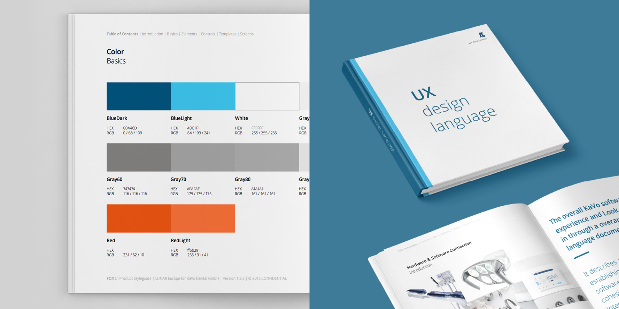
The overall KaVo software user experience and Look & Feel was defined through an overarching UX design language document.
