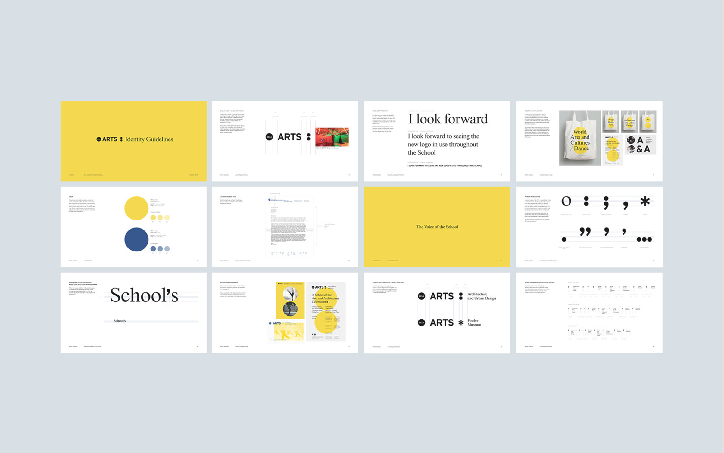
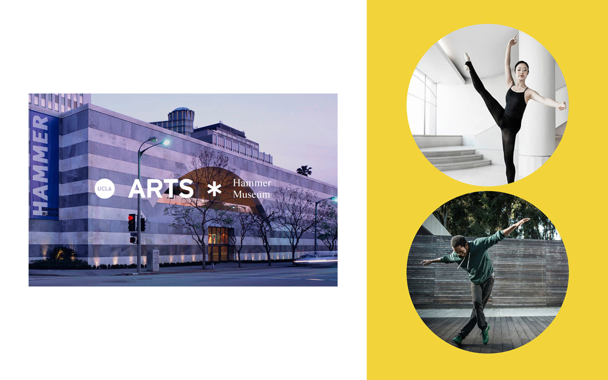
UCLA School of the Arts and Architecture is a diverse family, full of unique perspectives and voices. Working with the UCLA Arts team, we created a progressive and flexible identity system to reflect the unity between the School’s various programs and museums, as well as the unique voices within them.
The colon signifies something more to come. It precedes an explanation or an enumeration and allows for a deeper rendering of an idea. By using the colon mark, we celebrate the breadth and depth of the school; the colon mark assigns visibility to those unique voices—ideas, entities, and individuals—that make up the School, rather than flattening this diversity into a static brand.
Our team created the concept for the identity, and applied it to stationery, merchandise, and promotional materials in both physical and digital formats.
