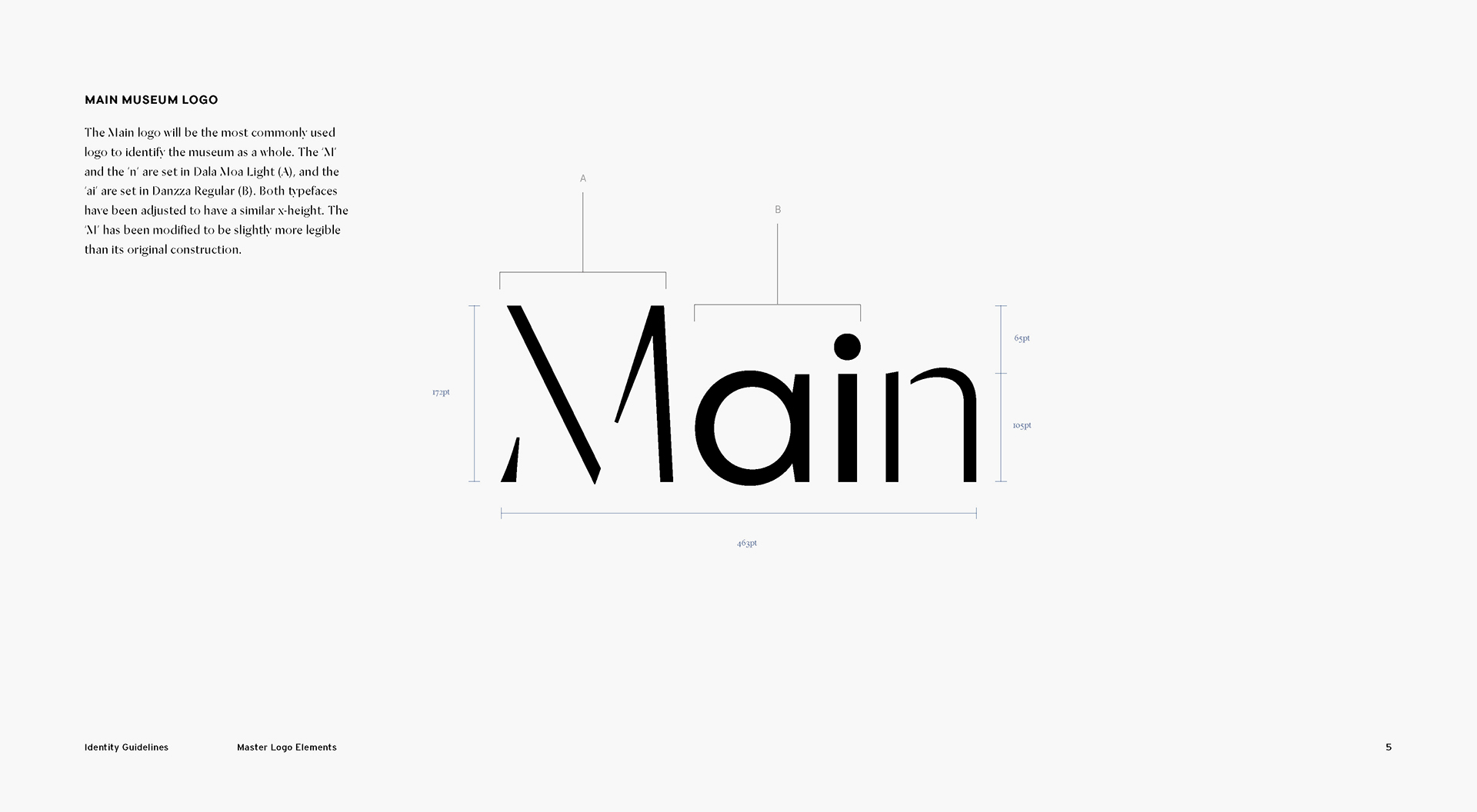
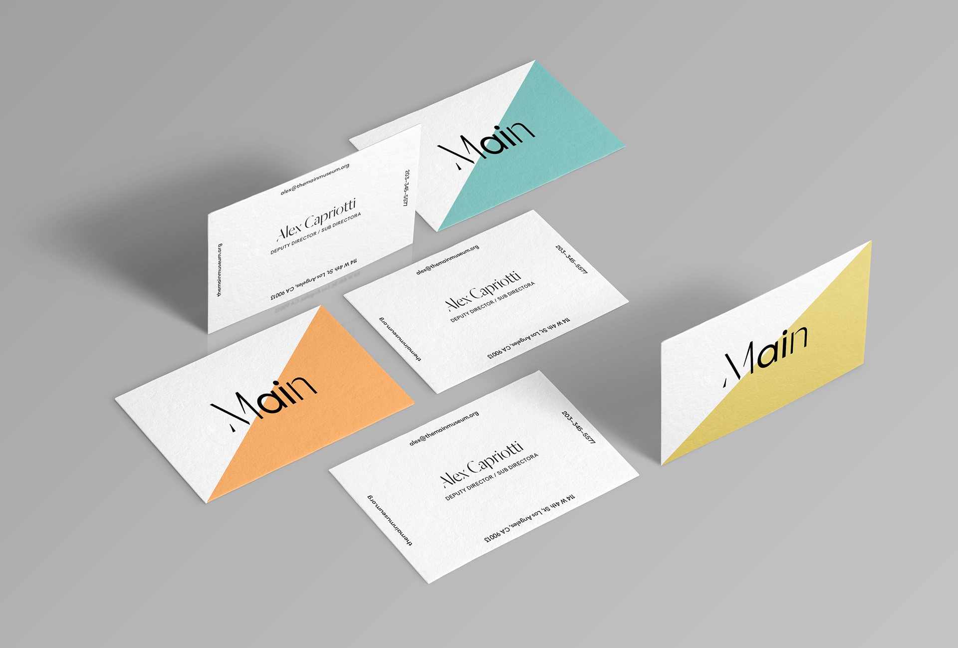
We partnered up with the downtown LA Main Museum to launch their new visual identity, reflective of the bilingualism of Los Angeles and the museum’s goal of being inclusive to the local community. The Main Museum has been described as a testing-site, embracing their experimental spirit. The logo we designed for them tries to convey the ongoing nature of process and experimentation by having some letterforms incomplete–a visual motif feeling unfinished.
The redesigned logo uses two typefaces, Dala Moa by Commercial Type and Danzza by Heavyweight, with some custom treatment to the 'M' letterform for legibility purposes. The typefaces are meant to be fluid in their use across the museum’s collaterals and not one typeface was assigned to a specific language. Offering both Spanish and English is a vital pillar of the Main Museum’s values and communication strategy.
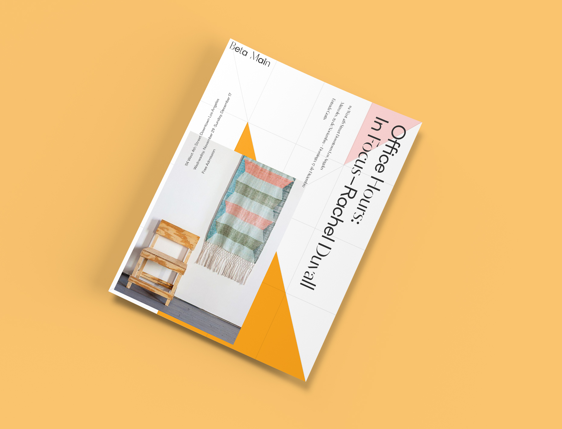
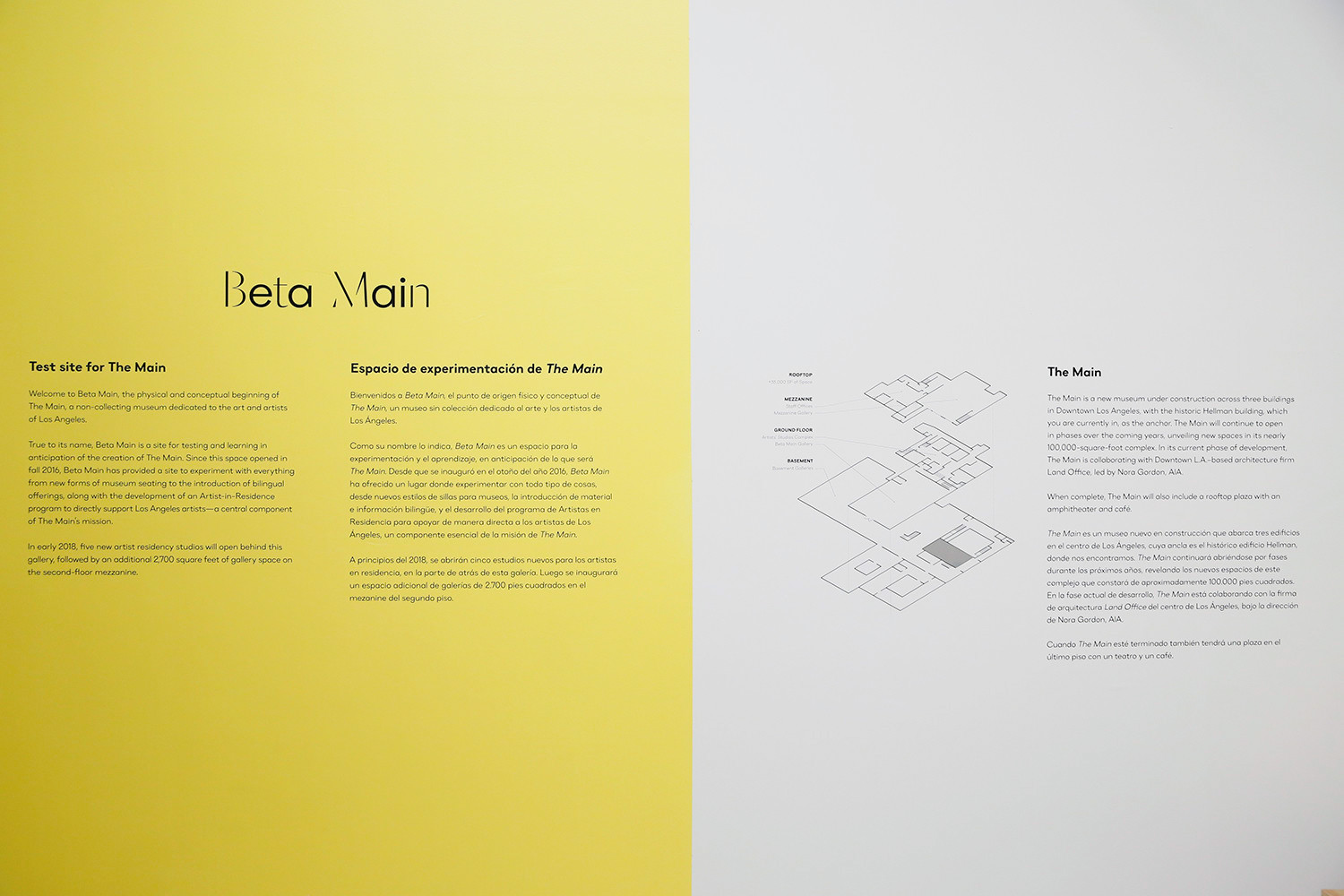
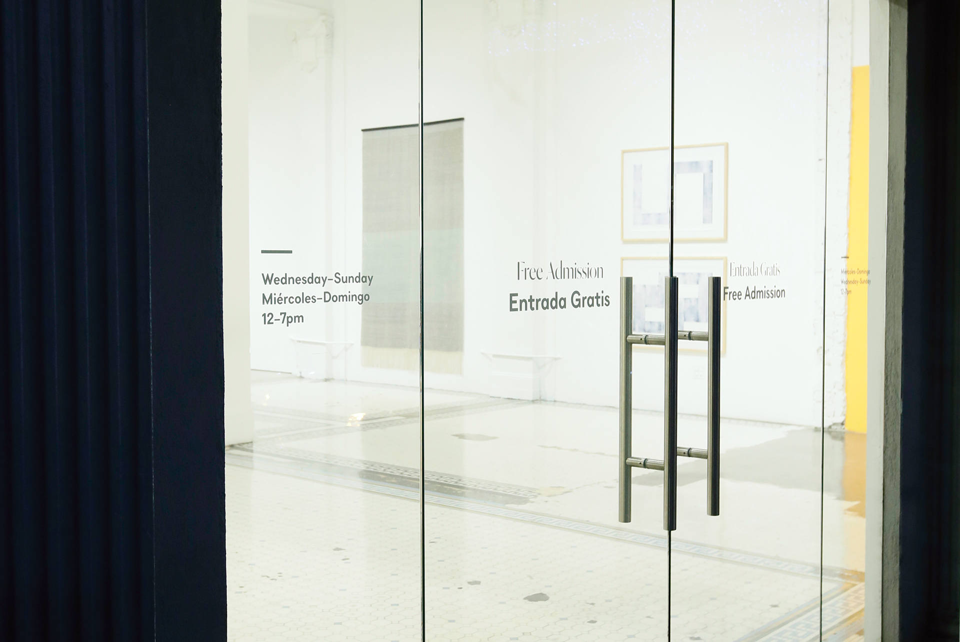
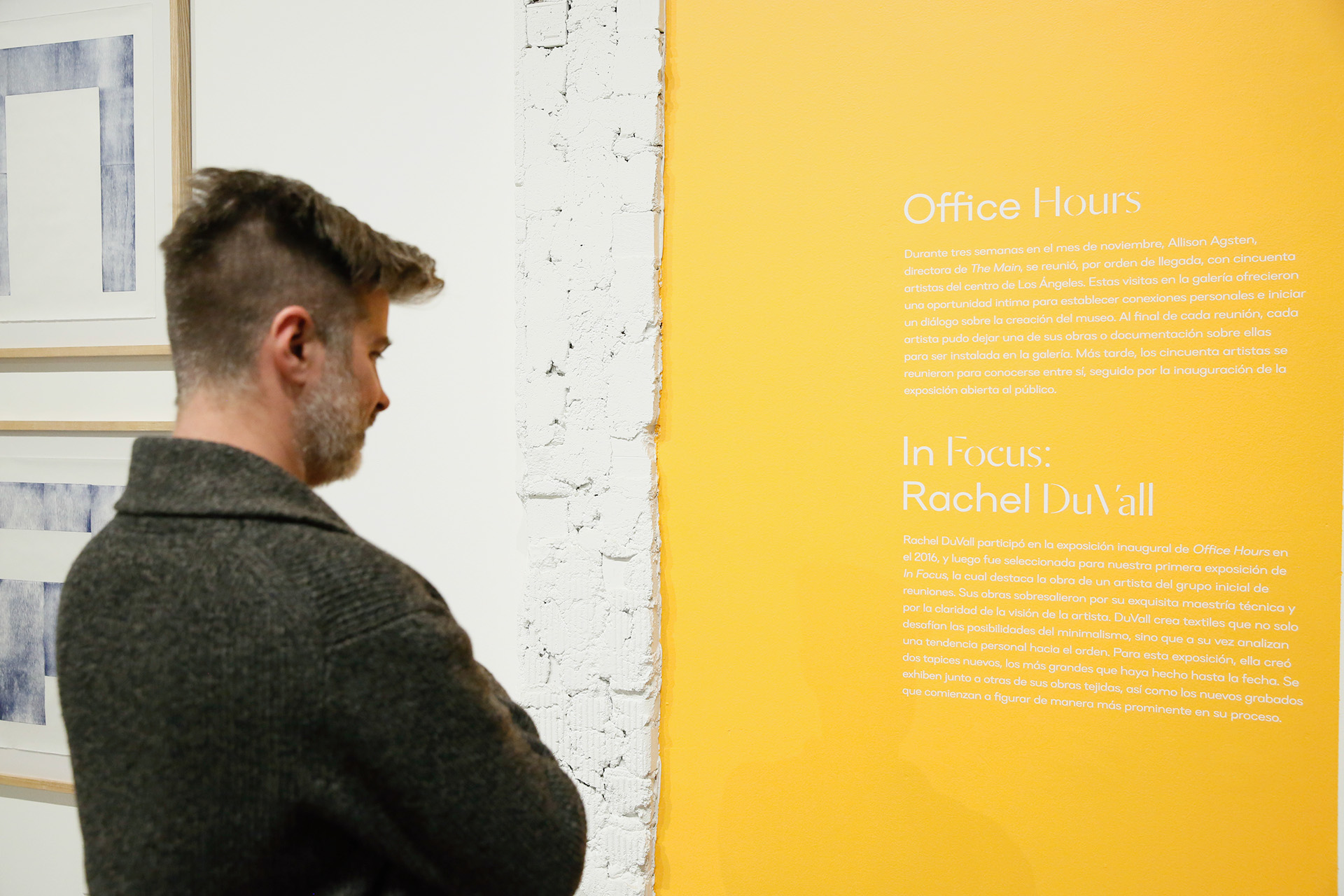
In the identity guidelines, we created a simple underlying grid structure for any collateral item to be influenced by. This grid can adjust to essentially any format or proportion. Leaving it up to the designers discretion, they choose how to activate the grid with type, image and color. We encourage keeping the grid structure visible as it illustrates a prototype-like process, displaying how the museum can continually compose itself it various ways.