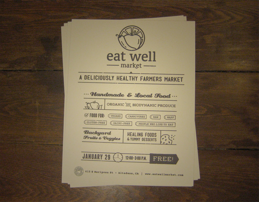
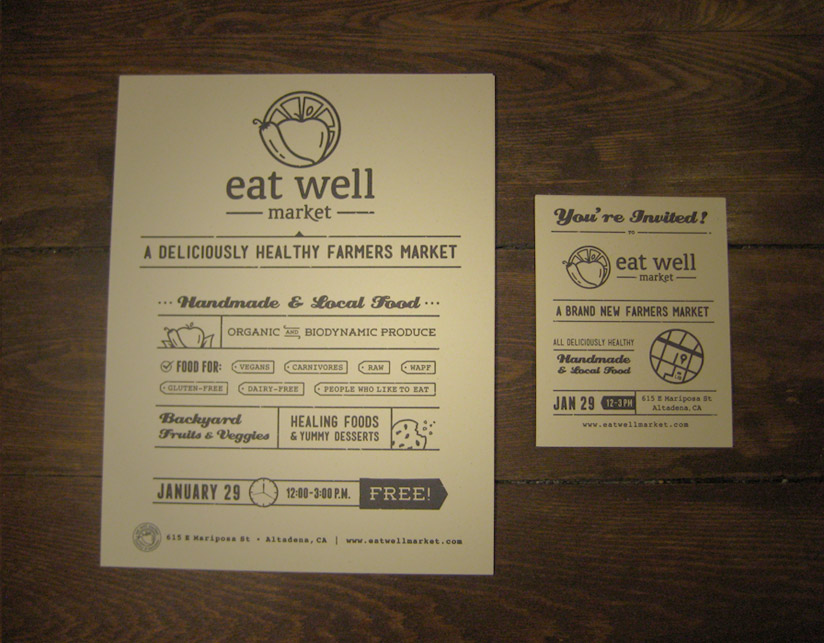
Eat Well Market is a "deliciously healthy framers market" based in Los Angeles. I worked closely with the team to create the identity, website, and print materials, which included posters, a flyer, as well as the business cards.
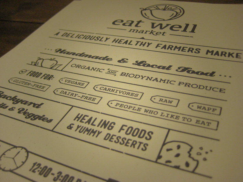
The market was really looking for an identity that had a fun and inviting appeal to it. One that happily encouraged people to "eat well". To convey a friendly and inviting tone in the logo, I went with a lowercase typeface and smooth, rounded edges in both the font and the icon. The poster followed suit, with its range of fun fonts, and the use of playful icons.
Testimonial:
"I cannot recommend Dan [Tilted Square Designs] highly enough. He is one of the most gifted designers I have ever hired. We needed a website, logo, and posters built quickly - the results he created for us far exceeded our expectations. The first word out of almost everyone's mouth when they see the website he designed for us is "wow". And he has a special talent for translating whatever feeling you are trying to convey into the right typography and logo. We just couldn't be more pleased."
– Aimee S, Eat Well Market
