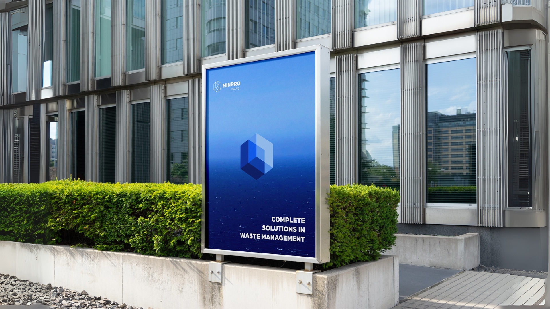
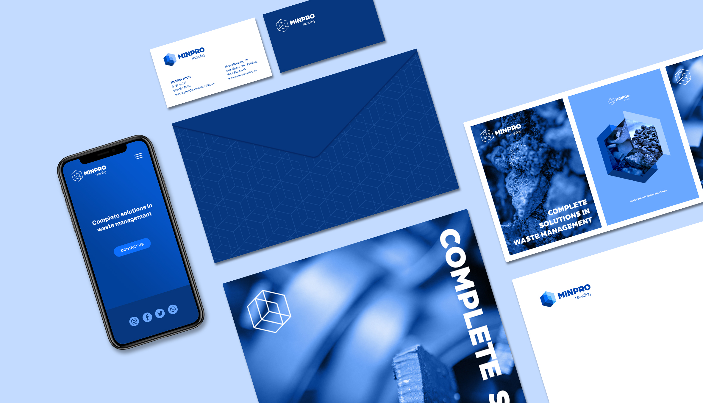
Minpro Recycling transforms complex waste challenges into smart, sustainable solutions, taking the recycling of hazardous waste to new heights. Their goal is to stand out as a trustworthy and professional partner in an industry often marked by unreliable players.
Minpro turned to me to develop a new visual identity that would convey trust and credibility, helping to position them as a leading, reliable force in the industry.
While bringing this vision to life, I also wanted to find a way to capture the recycling process yet avoiding the clichéd symbolism often used within the recycling industry.
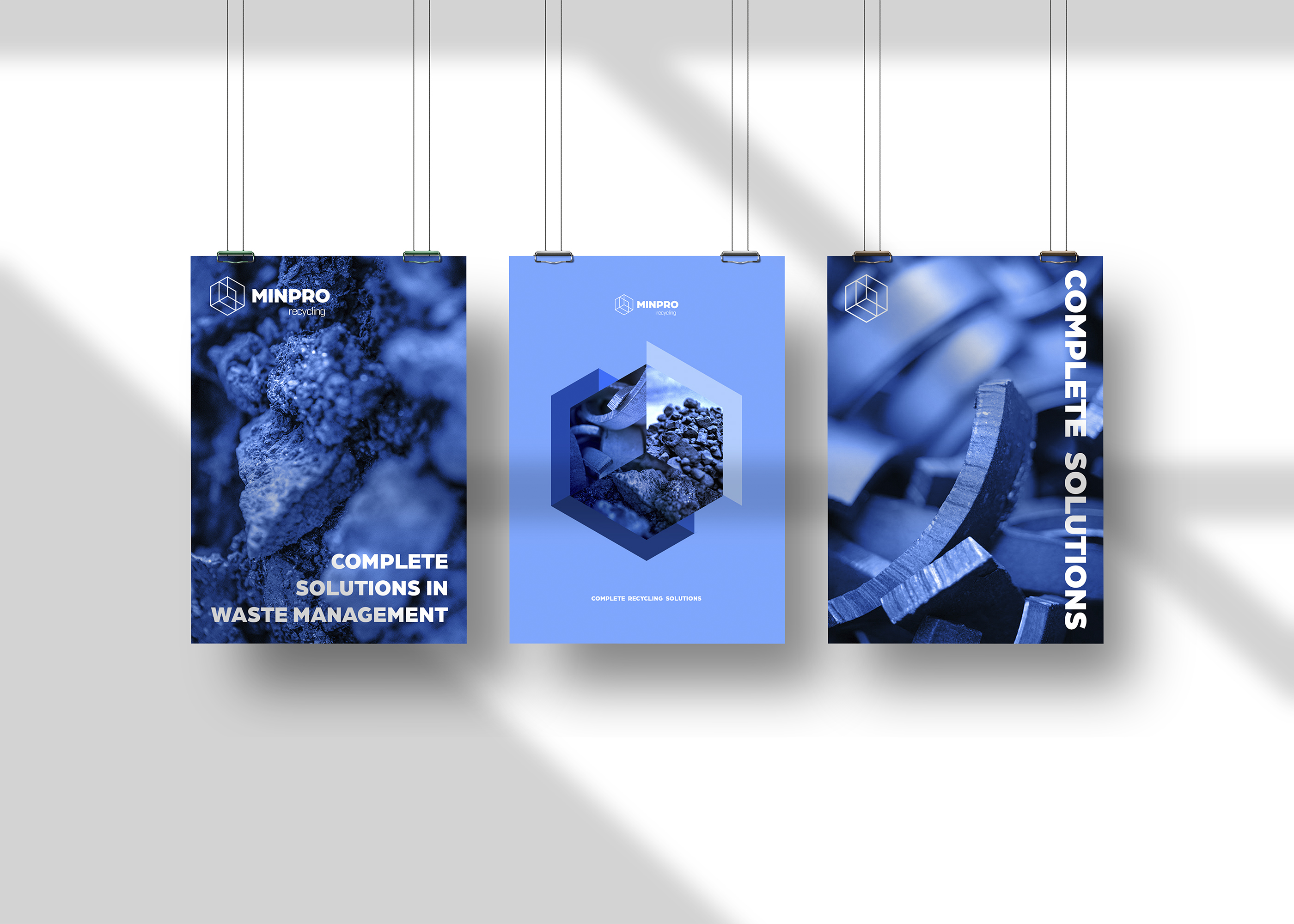
I designed the mark in the shape of a hexagon, a geometry that evokes a shield or a badge, conveying stability and safety. To echo the different stages of the recycling process I divided the shape into segments which can be seen as transparent compartments.
This way the mark also plays with perspective, forming an optical illusion of
a cube or a box, symbolizing Minpro’s “complete solutions” approach.
The result is a distinctive mark and a logo that radiates trust while mirroring the layered work that Minpro Recycling do.
