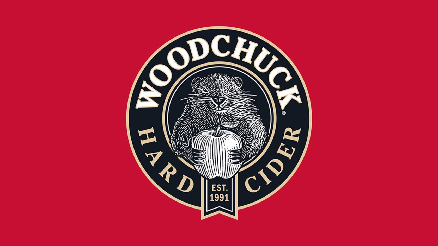
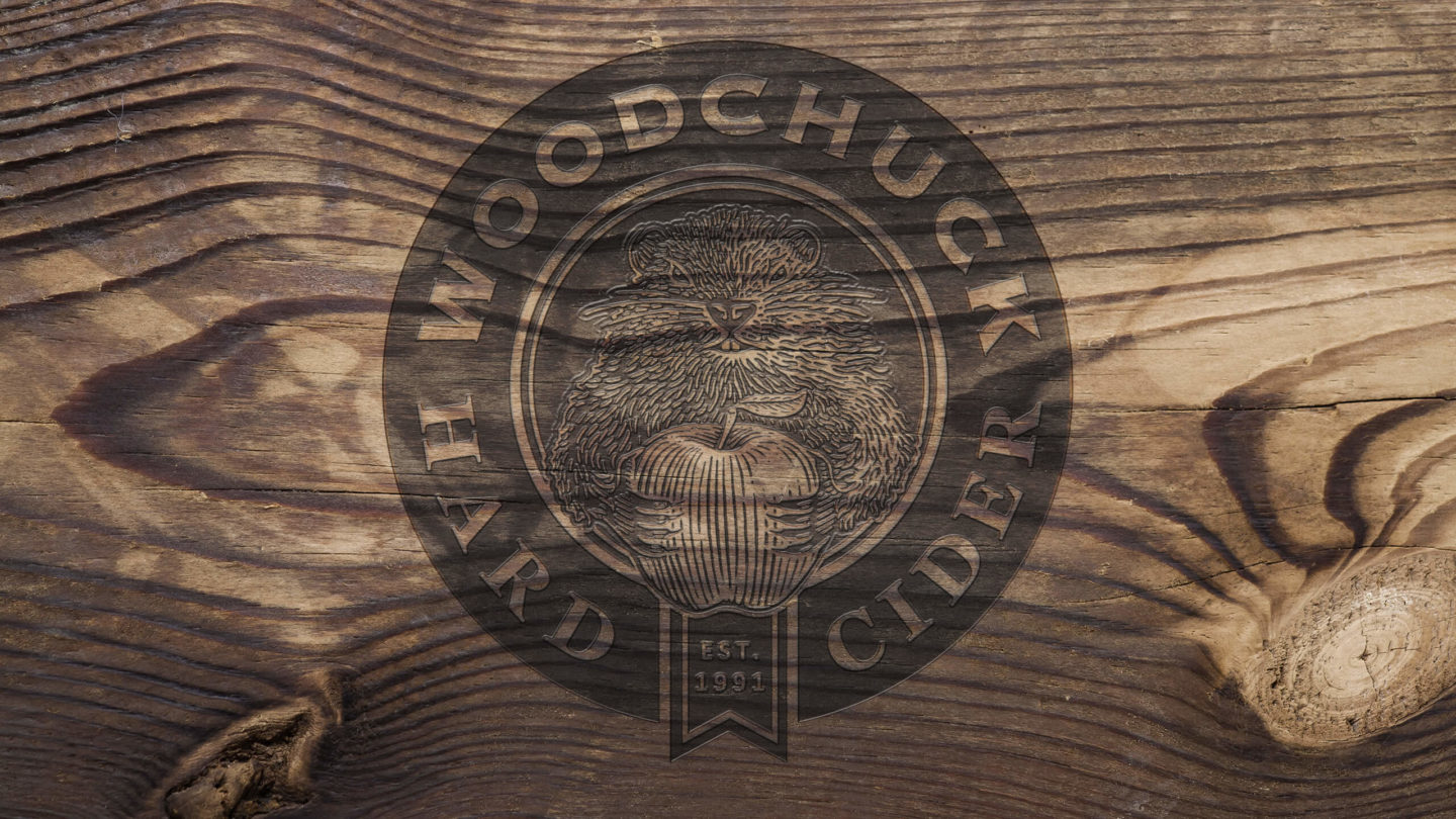
To celebrate 25 years in business, Woodchuck requested a revamp. Sprout was tasked with designing the new logo, label and packaging. We were asked to reposition Woodchuck Hard Cider by evolving and bringing the Woodchuck back to the package, and giving "Chuck" more personality while making him both more approachable and modern.
To achieve this, Sprout started by creating a woodcut illustration of "Chuck" holding their main ingredient, apples. The woodcut also helped to bring back the authentic heritage, and craftsmanship, of this Vermont brand. We used shadows and highlights to create a juxtaposition between the left and the right of the illustration to give him a mischievous look.
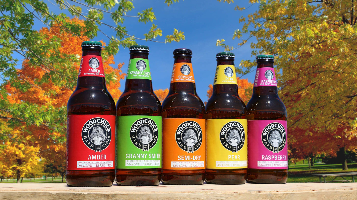
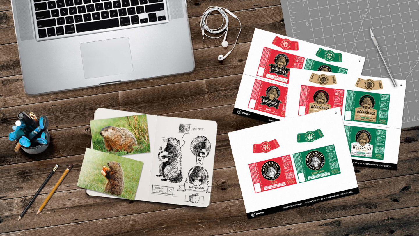
We also designed the labeling system to accommodate cider varieties by simply swapping out the pop color and cider name while maintaining the overall brand language.