Perkin Elmer's new brand positioning, ‘For the Better’, meant a new design direction for the global leader in human and environmental diagnostic and therapeutic solutions. But the challenge was how to translate this new vision into a physical design language.
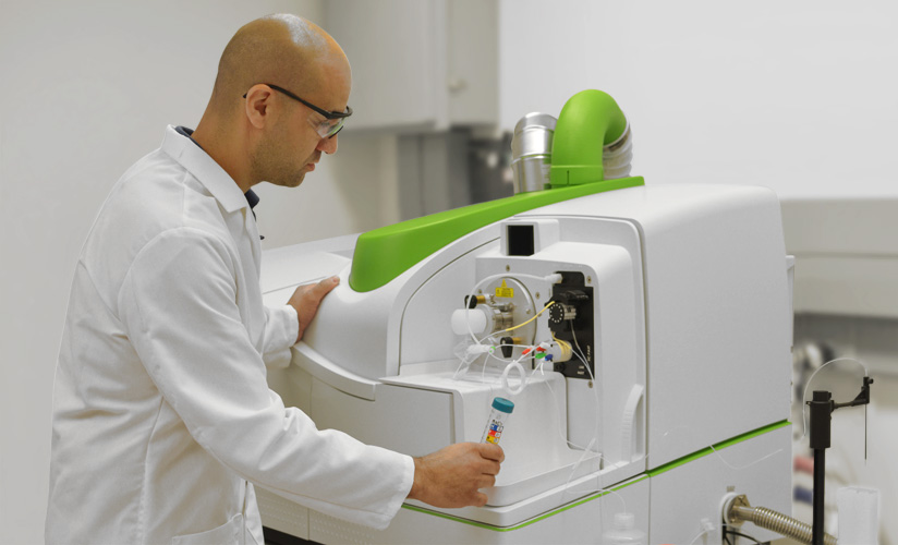
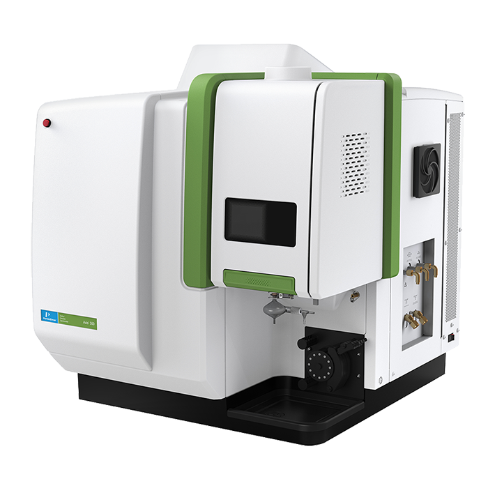
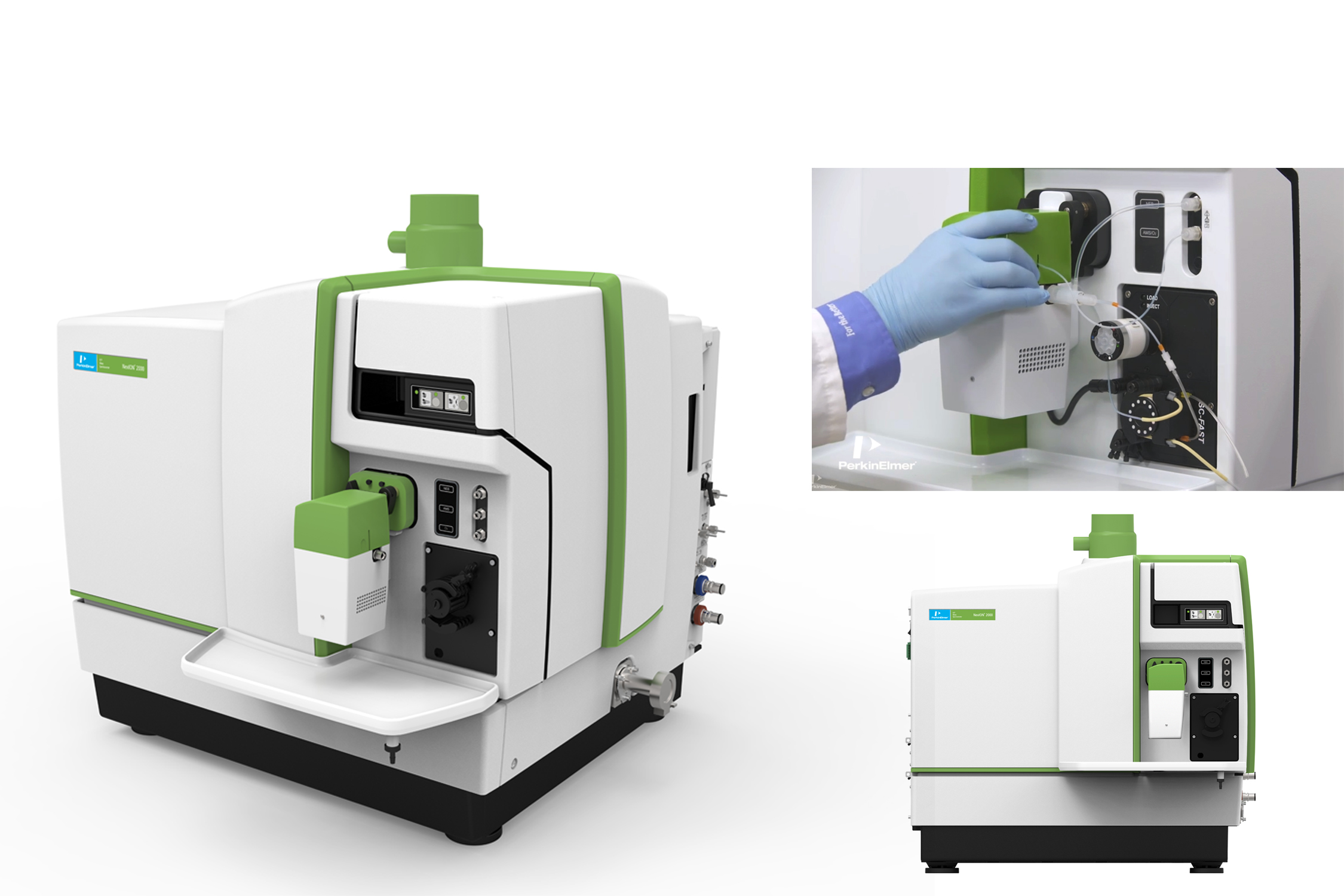
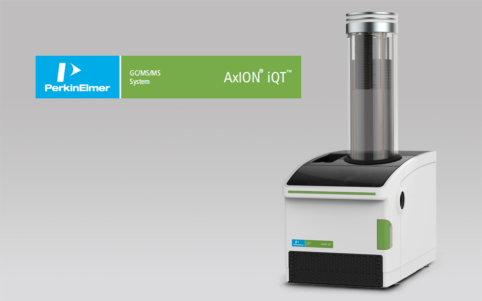
We worked closely with Perkin Elmer's Brand Strategy team to have a better understanding of the new Company mantra. ‘For the Better’ was designed to break the mold of the hi-tech machinery market, moving away from cold and analytical imagery, and instead imbuing the brand with a more user friendly and open feel. Soft flowing lines were used on the NexIONm 300 mass spectrometer. This gave the machine a warmer, more organic feel. But then we hit a design hurdle. Implementing the strategy on new machines was easy, but how could we update existing products in the catalog? The solution was a design manual that allowed older machines to be reinterpreted with the new design language.Within the manual, we established principles such as the fresh green (show a page out of manual) to bring cohesion to Perkin Elmer’s suite of machinery. Color was also used to indicate machinery interaction points, helping to reduce the user learning curve. The result is a design manual that not only brings cohesion across existing stock, but also lays the foundation for future instruments. But the real result is unity. Connecting the company strategy to the image, to the physical products, right through to the end user experience.