Context:
In 2008 routers were being perceived as techy and complicated. The difficulty of setting up a router was both a purchase detractor and a source of costly service calls. Belkin had made tremendous progress in designing a setup and service experience that was easy enough to complete for anyone.
Objective:
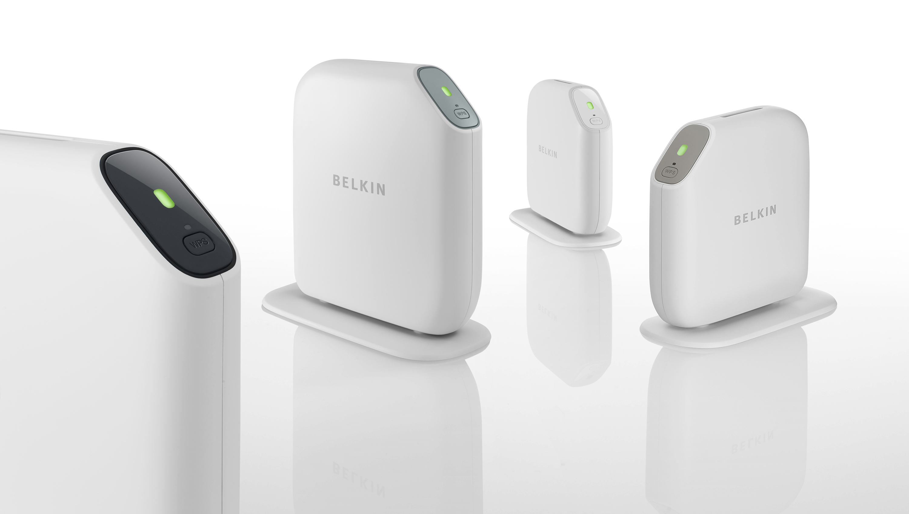
The visual language of the routers needed to communicate simplicity and ease-of-use. The goal was to instill confidence in a non-technical consumer. We referenced objects that were associated with peace of mind. The shape, colors and finishes of the routers are driven by ceramics and natural elements such as river rocks. Technical signifiers such as vent slots or LEDs have been reduced to a minimum.
What we did:
Product Architecture
Industrial Design
Engineering Liaison


