What? Swark is a company that works with real estate investment in Porto's historic areas.
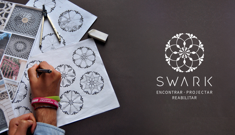
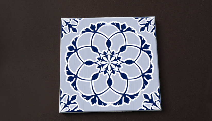
They specialize in rehabilitation, following the whole process from the househunting to the rehabilitation work itself. The creation of the branding was inspired by the architectural and cultural richness of Porto: the tiles, the stucco, the wrought iron railings, the wallpaper, the doors, ... The logo is a junction and interpretation of various elements and it can turn into one of them: it may be a tile, a stucco in the ceiling or the wall paper of a noble house, it can be an element of a door or integrate a railing of a balcony overlooking the Douro.
The branding is thus a complete cycle as the Swark service.
How?
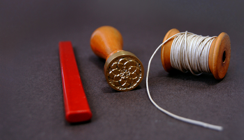
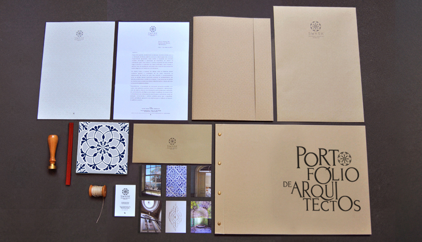
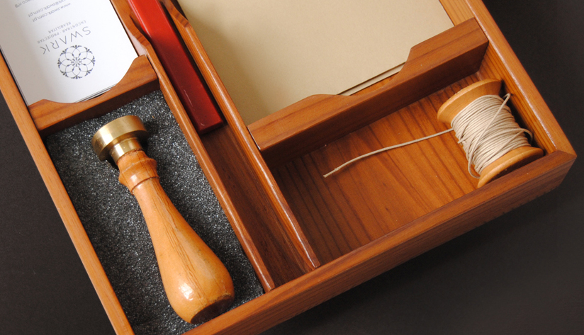
The logo was designed with inspiration from architectural elements such as wrought iron, stucco, wallpaper, tiles. For the communication materials we chose kraft paper which, besides ecological, is textured and refers to the antique without losing refinement. Other elements were created to supplement the materials as a signet seal and a string.